
I kept
all of the backgrounds in the Second
Position banners white while using a black and white image or black text
with a pop color to emphasize the central selling point of the banner. For
example, in the banners with the images, the background remains white with a
black and white image and the dancewear item is the only piece of the image
that is in color. In the banners with the words, the selling point of the
phrase is in color, like the word “affordable.” The banners are also all
tied-together with the Second Position logo,
either in the color of the item being emphasized, or in the original hot pink
color. The banners also all have a black button that reads “SHOP” in white
lettering, all the same font.

This is my favorite banner design. In this, I
implemented emphasis by contrasting the black and white in the majority of the
image with the pink color of the shoe. I included repetition by repeating the
color of the shoes in the logo. I created balance by aligning the “SHOP” button
and the logo on the right side, and keeping the image on the left. I intended
that the image flow from the shoe and the logo to first emphasize what was
being sold and the brand selling it, then up to the “SHOP” button so that the
viewer could shop the brand.
_____________________________________________________________________________
1. Post bulleted list of 5-10 business web site possibilities, and post 5-10 banner examples you researched that caught your eye after reviewing hundreds.
I am stuck between creating these banners for my own personal business, Second Position, or my parents' restaurant business, which is in the works. I am heavily leaning towards my business, but I'm still on the fence.
BANNER EXAMPLES:
Pretty much everything on http://www.beautifullife.info/web-design/best-free-professional-banners/ caught my eye, but here are my 5 favorites;
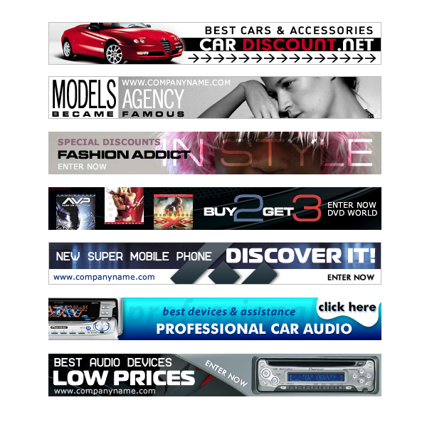
(2nd and 3rd)
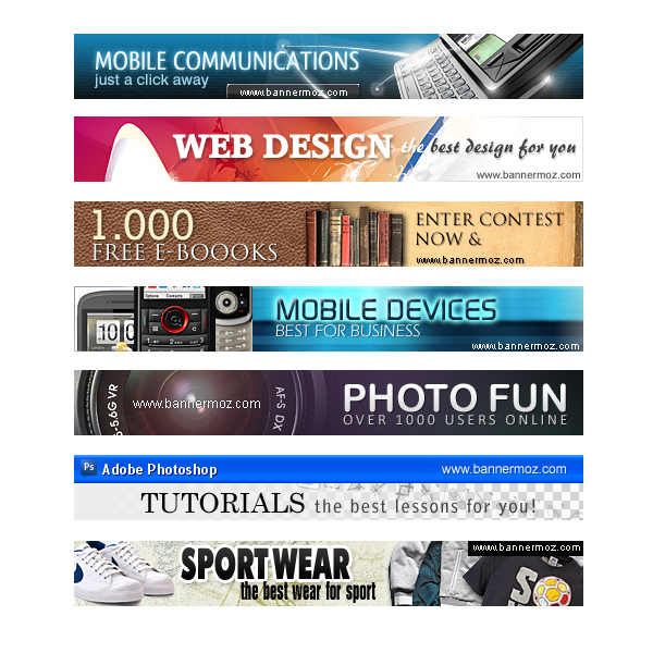
(1st, 4th and 5th)
2. Create bulleted list of 10 design elements that caught your eye after reviewing hundreds.
- Dark background with a lighter text color
- Having a photo take up the background of the banner (or most of it)
- Having a pop-color
- Playing with form-expressing content in the font
- Black and white with a pop-color
- Heavy use of black and white
- Including a border around the banner
- Having a drop shadow around the image
- Use of a logo
3.
Design elements I plan on using.
- Use
of a logo- Including an image
- Lighter background with darker text (or the opposite)
- Having a pop color
- Including a border around the banner
4. Round one thumbnails (10).


