Wednesday, November 20, 2013

Commemorative Stamp Design


1. Collect visual examples (20) of stamp designs that are visually engaging to you. 


ALL IMAGES FOUND ON GOOGLE IMAGES.

2. Choose your three favorite designs and make a descriptive list (in bullet form) referencing informational and design elements that are contained within the image. 


MOULIN ROUGE 
INFORMATIONAL ELEMENTS:
1. The central image shows that the Moulin Rouge has something to do with dancing, is upbeat, maybe is busy because of the depiction of all the people. 
2. The stamp states the days of the event and exactly what it is, "les Mercedies et Samedis" "Bal Masque"
DESIGN ATTRIBUTES:
1. The colors are very dulled but still look vibrant because of the contrast. 
2. The illustration looks like a painting, maybe a water color?
3. The type is mainly horizontal, but there is a wave added to the Moulin Rouge type. 
4. There's emphasis created in the repetition of the word "Moulin Rouge" using the large "M" and also in the variation of text sizes. 
5. When you look at the image, you first see the illustration. Though it is in the back of the composition, and though its only showing one person in great detail, it looks vibrant and fun and definitely draws the viewer in to learn more. The repetition of the "Moulin Rouge" is where I go next, then to the rest of the words colored in red, then I go to the black text in the upper righthand corner. 
6. The illusion of depth is created by contrasting the light characters in the front with the dark characters in the back. Though that is opposite of how most create depth (using darker objects more forward and lightening them further into the space), it absolutely works. 
PULP FICTION
INFORMATIONAL ELEMENTS:
1. The central image is of a woman who appears to be fixing an earring (?) in a mirror. The artist was sure to not only depict the woman but also her mirror image. 
2. The "stamp" states the name of the film, "Pulp Fiction" and also the director, "Quentin Tarantino". 
DESIGN ATTRIBUTES:
1. The colors are very bright and vibrant. The artist of the poster stuck with red and gold-yellow values, which create a very nice contrast. By using lighter shades in the mirror image, depth is created.
2. The illustration looks like a digitally rendered piece. The bright white shading in the hair, arm, and leg of the woman remind me of gouging in printmaking. 
3. There is vertical type in the title of the film and horizontal type used in the listing of the director. Emphasis is created in the size of the type being used in "Pulp Fiction" when compared to the type size of "Quentin Tarantino". 
4. At first glance, you first look at the illustration of the woman, then to the title of the film "Pulp Fiction." The last thing I looked at was the name of the director in the bottom right. 
5. The illustration takes up more than half of the poster and almost the complete height. The text is aligned with the image on the right side. 
F. CHAMPENOIS
This image isn't very readable, but I chose this as one of my favorites solely for the look of it. I love the color choices, they're very calming and light. The contrast in the green and the pink is striking. I'm a huge fan of flowers, and the design behind the woman is beautiful to me. I love the intricacy of the piece and the whimsical nature of the design. 
3. Though I love the Art Deco and Art Nouveau styles, my commemorative stamp design will be in the style of Russian Constructivism and will commemorate Mikhail Baryshnikov's as well as other ballet dancer's break from Russian ballet.

4. Examples of Russian Constructivism and my stamp design. 
THUMBNAILS FIRST ROUND:


THUMBNAILS ROUND 2:


MY STAMP DESIGN ILLUSTRATION:


FINAL PRODUCT:



Tuesday, October 8, 2013

Website Promotional Banner Project

I kept all of the backgrounds in the Second Position banners white while using a black and white image or black text with a pop color to emphasize the central selling point of the banner. For example, in the banners with the images, the background remains white with a black and white image and the dancewear item is the only piece of the image that is in color. In the banners with the words, the selling point of the phrase is in color, like the word “affordable.” The banners are also all tied-together with the Second Position logo, either in the color of the item being emphasized, or in the original hot pink color. The banners also all have a black button that reads “SHOP” in white lettering, all the same font.

This is my favorite banner design. In this, I implemented emphasis by contrasting the black and white in the majority of the image with the pink color of the shoe. I included repetition by repeating the color of the shoes in the logo. I created balance by aligning the “SHOP” button and the logo on the right side, and keeping the image on the left. I intended that the image flow from the shoe and the logo to first emphasize what was being sold and the brand selling it, then up to the “SHOP” button so that the viewer could shop the brand.
_____________________________________________________________________________

1. Post bulleted list of  5-10 business web site possibilities, and post 5-10 banner examples you researched that caught your eye after reviewing hundreds.

I am stuck between creating these banners for my own personal business, Second Position, or my parents' restaurant business, which is in the works. I am heavily leaning towards my business, but I'm still on the fence.


BANNER EXAMPLES:

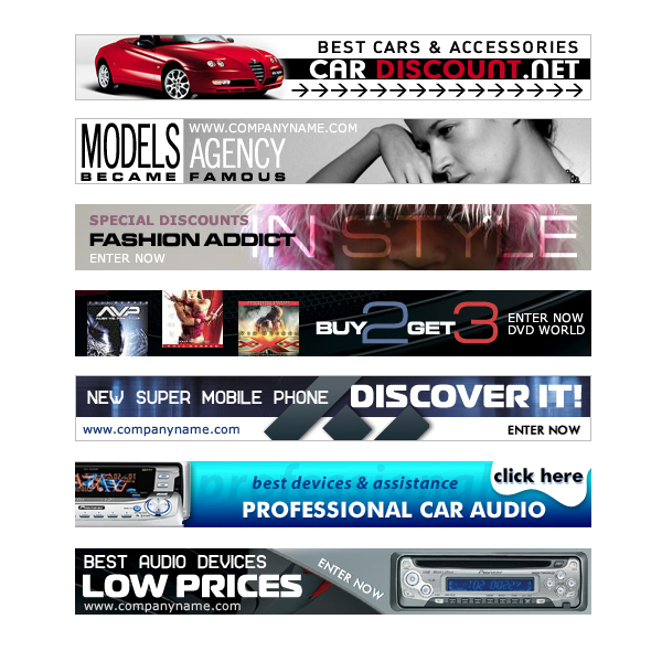
Pretty much everything on http://www.beautifullife.info/web-design/best-free-professional-banners/ caught my eye, but here are my 5 favorites;
free banners templates psd
(2nd and 3rd)

free banners templates psd
(1st, 4th and 5th)

2. Create bulleted list of 10 design elements that caught your eye after reviewing hundreds.
- Dark background with a lighter text color
- Having a photo take up the background of the banner (or most of it)
- Having a pop-color
- Playing with form-expressing content in the font
- Black and white with a pop-color
- Heavy use of black and white
- Including a border around the banner
- Having a drop shadow around the image
- Use of a logo


3. Design elements I plan on using.
- Use of a logo
- Including an image
- Lighter background with darker text (or the opposite)
- Having a pop color
- Including a border around the banner

4. Round one thumbnails (10).


Monday, September 23, 2013

Second Position Logo

This past spring, I competed in the local Greater Binghamton Scholastic Challenge with my business Second Position. Though we didn't take home the overall prize, we did win "Best Idea" and were praised for our logo design.
 
I designed this logo to look like the placement of the legs in second position, which is a ballet position in which you stand with your legs about hip-width apart and your feet turned out. I wanted it to look like a whimsical drawing, something along the lines of a quick doodle, since we did plan on targeting a younger age group. I kept the logo pink because pink is the trademark color for dance.


Thursday, September 19, 2013

Some Previous Design Work


Here's a logo design I recently did that is being considered for the Student Dance Organization at Brockport. I chose to use modern dance poses to spell out the letters "SDO" because the Organization and the Brockport Dance Department in-and-of-itself is heavily weighted towards modern dancing, and is noted for its unique style. I kept the font beneath the figures simple, but still noticeable, because the main focus of the piece was on the Student Dance Organization, though the Brockport Dance Department had to also be recognized.


These are two logo designs I did for Dancescapes's 13th Annual Recital this past June. I was asked that the word "dance" had to be incorporated in a bunch of different languages, and from there I decided to use the words to develop an image of a dancer.
This is a tattoo design I did recently. The original image I got was of an infinity heart ring;
I was asked that the design of the ring be kept in the design of the tattoo. As I was sketching some ideas, I realized that there were two letters present in the design; a "C" and a "B." After noticing this, I emphasized the letters in the design, since the initials of the first names of the ladies I was doing the design for were "C" and "B." They plan on getting their tattoo done sometime within the next couple of months.
 
 
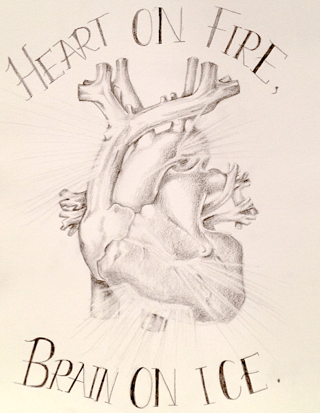
This is another tattoo sketch I recently did. For this one, I was asked to draw a realistic heart and make it appear as though light was breaking through it, then accompany the drawing with the words "Heart on Fire, Brain on Ice," which is a theater phrase.


Sunday, September 15, 2013

Intro to Computer Graphics Metaphorical Self-Portrait Process

Thumbnails:


Playing around with proportions:


Playing around with the arrangement of the words:


Final composition:

I tried to incorporate the design concepts through either the size, shade, or placement of the words individually and as a whole. I emphasized the word "selfless" by increasing its size in comparison to the surrounding words. Emphasis is also incorporated in the aspect of contrast. I wanted to emphasize the word "selfless," "optimistic," and "spontaneous," because those are my top three, in order, so I kept those black and lightened the "forgetful" and "procrastinator," which were lower on the hierarchy. I balanced the image by lightening the words "forgetful" and "procrastinator," which are on opposite sides of the image. I tried to align the image so that the viewer’s eye would travel, or so that the flow of the entirety of the image would direct, downward, starting from the word “selfless” and ending with the repetition of “procrastinator.”
 
 
On top of trying to incorporate the design concepts in my final composition, I also tried to arrange the words individually so that they communicated their meaning. Generally, shy people don't like to be the focal point of much of anything, so I tried to keep the word as unnoticeable as possible without making it completely disappear. I kept it very small and off-center, sitting on top of the word "selfless" which is the focal point of the image and immediately draws the eye to it, hoping that by placing the word in that spot, the viewer will at first overlook it, then eventually notice it once they've seen the other words. A selfless person essentially doesn't think of his/herself. To communicate this, I struck out the word "self" in "selfless." I also took the word "less" and brought it down underneath "self” to communicate how selfless people always think less of themselves. When I think of the word "optimistic," I think of happy, whimsical, beautiful things, and personally I believe the most whimsical and beautiful kind of writing is cursive, so I wrote optimistic in cursive. Spontaneous people are usually fun, crazy, and very unpredictable. I chose the font for “spontaneous” because it looks very random and it was unpredictable; as I was typing the word, I wasn't sure how the next letter was going to look, and I definitely wasn't expecting the "O" to loop around in that interesting shape. I dropped the "t" in "forgetful" to imply that it was forgotten. I didn't want to completely rid of it, because I had already planned to cut the word "procrastinator" short. Procrastinators are the kind of people who "finish everything later." So, I chose to cut the word short and add an ellipsis at the end to imply that time was passing and essentially that the word would be "finished later."